Vertical
Service Provider
Our team
Creative Director, Brand Strategy Director, 2 Designers
Client team
CEO & Head of Marketing
View Website Watch the anthem videoThe Brief
Capital Group came to Wolf&Whale with two core problems: how to communicate what they do, and how to creatively express who they are. They needed a clear and bold way to express their mission and capabilities to clients with an innovative, energizing design.
Wolf&Whale not only created a new design system and identity, but also helped Capital Group develop clear brand guidelines that inspired their content, social calendar, and overall communications strategy.
What we did?
As part of our initial brand strategy work, we initiated an in-depth process of stakeholder interviews, archetype analysis, copywriting, and social media development that helped clarify what makes up the ethos of Capital Group, how they want to communicate it, and where they can share it.
From that foundation, we led a collaborative design process exploring multiple concepts that reflected their brand pillars: Authority, Achievement, Expertise, and Partnership. We eventually landed on a sophisticated, authoritative design language and user experience that helped position Capital Group as a consultancy challenging the status quo of other dated, slow D.C. consultancies.
The result.
The result led to a new a design and campaign that reflected Capital Group‘s distinctly fearless philosophy and approach. Their company has introduced themselves to a completely new market of clients, invited a larger group of potential employees and partners to attain a deeper understanding of the firm, and planted its flag in the consultancy landscape as a fast-moving, daring firm ready to take on any challenge.
Design to film
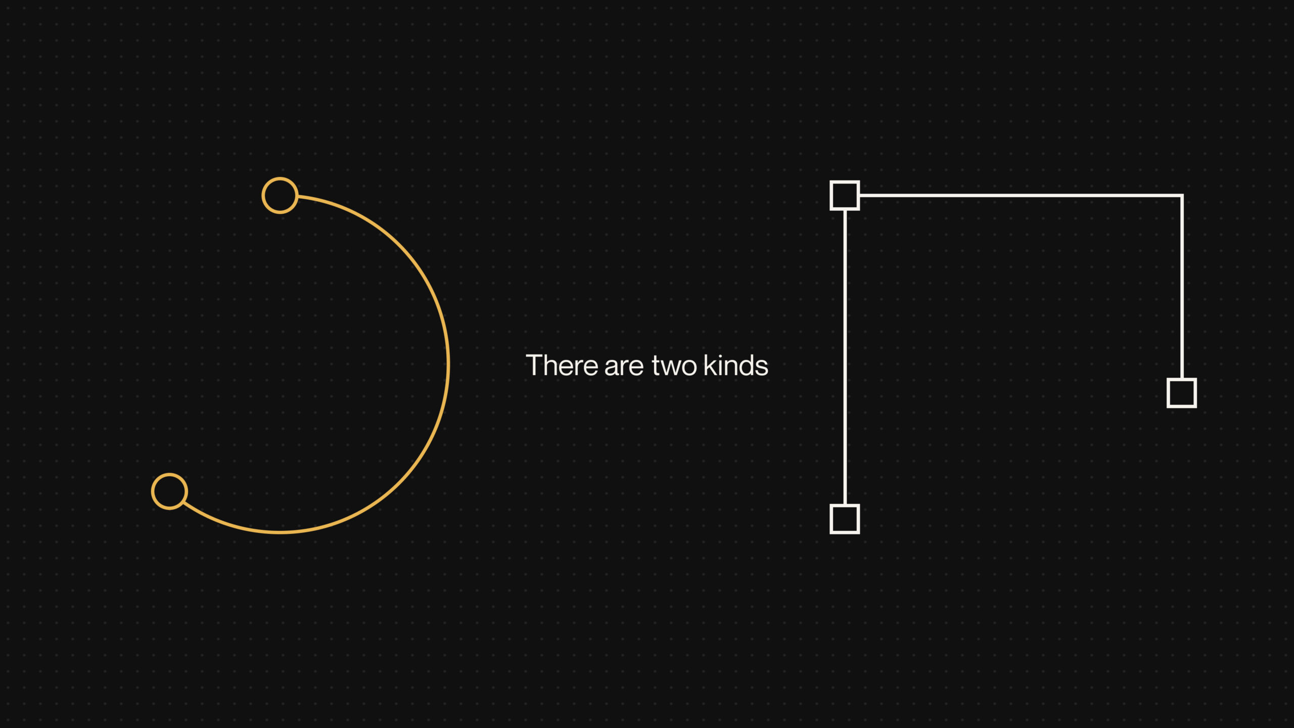
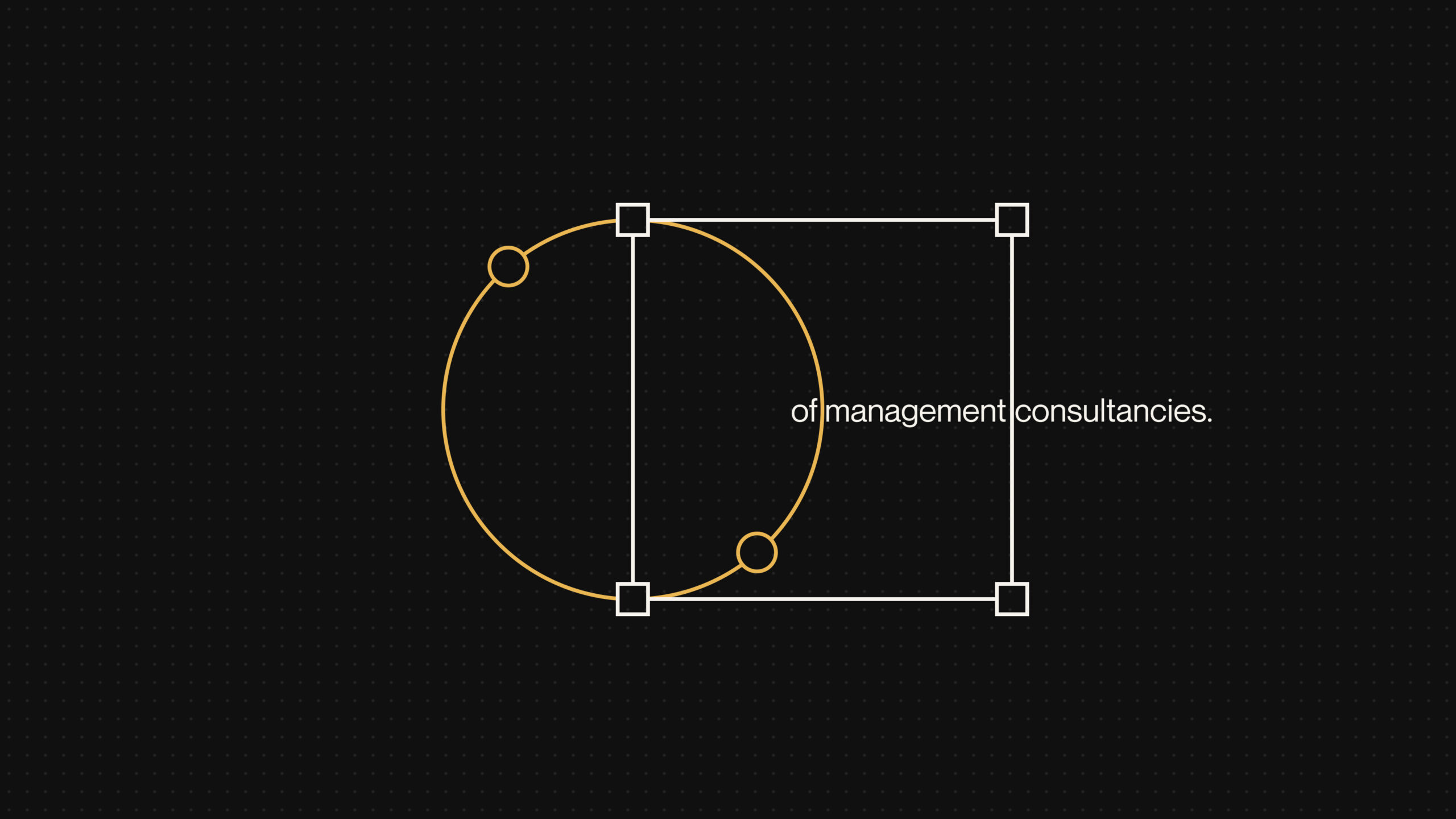
As a natural extension of the branding and design work, we produced a short commercial capturing the voice and tone of the brand, as well as their bold proclamation of being an ‘unreasonable consultancy’; a consultancy that over-delivers and breaks the cycle of doing things the way its always done. This was concepted and designed with our partner animation studio to match the visual language and direction of the branding. Bold typography and an iconography system helped sustain a fluid visual language within their video anthem.






“Aside from their excellent technical capabilities and knowledge, their personalities shine through in everything they do. Working with them is always fun and collaborative. They take their job seriously, but still seem to enjoy what they do.”
